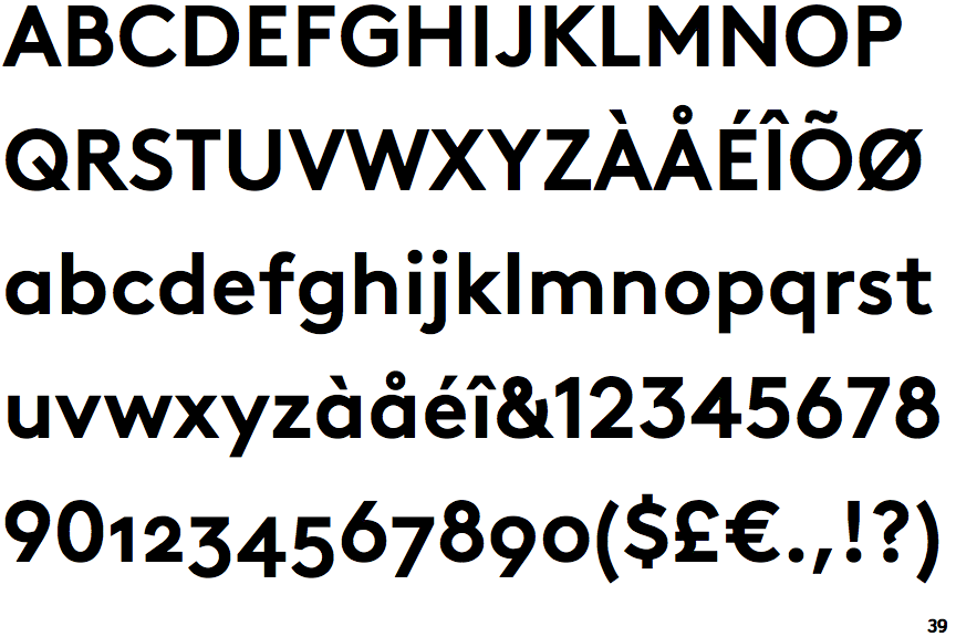

The regular cut is slightly larger than usual, making it especially legible, which also applies to the italics, slanted at a 10° angle. But in designing 'AS Brown', Sack was not interested in revamping an existing font he wanted to develop a typeface with a 'new and modern personality'.

Its unembellished clarity has set standards and it superbly demonstrates the influence of corporate design on the success of the company. Specialists will immediately identify Sack's model and laypeople will probably sense something familiar: Sack refers in general to the grotesk typefaces of the early 20th century, specifically to the trailblazing design of Edward Johnston (1872-1944), who was commissioned to create a typeface for the Underground Electric Railways of London in 1913. How can one follow in the footsteps of modernism and still develop a typeface that is entirely contemporary? Aurèle Sack, typeface designer and graphic artist from Lausanne, answers that question with his font family 'AS Brown', which took him four years to develop.


 0 kommentar(er)
